READY GO — An agency site where the headline is the showreel
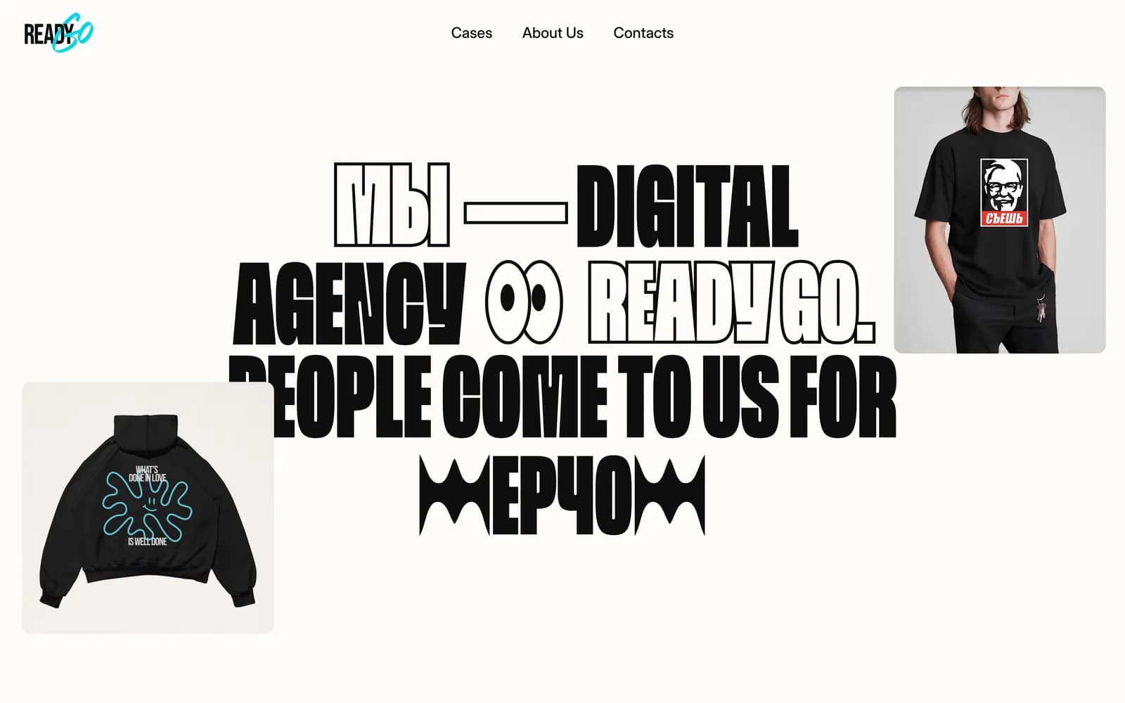
READY GO is a digital agency. Its site had to prove creative range in the first three seconds, so the headline itself is the demonstration: a fixed sentence with a final word that keeps changing.

Challenge
Every agency site claims range and every one of them says so in a paragraph. The proof has to be the artefact, not the copy — but a homepage still has to state plainly what the company does, or it becomes a portfolio nobody can categorise.
Approach
The headline states the fact — a digital agency — and then rotates its final word through the services on offer: production, strategy, merchandise, creative. The claim and the demonstration occupy the same sentence, and case imagery scatters around it rather than sitting in a grid below.
A headline that performs
'We are a digital agency. People come to us for —' and then the last word cycles. Each variant is drawn as custom display lettering rather than set in a font, so every state of the sentence is its own piece of typography.
It answers the categorisation question in the first line and demonstrates range in the second, without a single sentence of self-description.
Custom lettering as the identity
The display words are vector artwork, not type. That is what gives each rotation its own weight and distortion, and it is why the headline reads as a designed object rather than an animation effect applied to text.
The trade-off is deliberate and worth naming: because the words are outlines, they are images rather than selectable text, so the surrounding copy carries the meaning for anything that reads the page programmatically.
Work scattered, not gridded
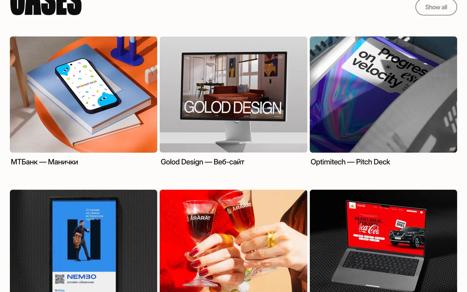
Case imagery floats at the edges of the headline at varying sizes and rotations, cycling as the sentence changes. A conventional grid would have said 'agency template'; the scatter says the layout was made for this content.
Restraint everywhere else
Navigation is three plain links. There is no hero video, no scroll indicator and no cookie-consent theatre competing with the headline. Everything the site has to spend is spent in one place.
Build
Next.js, served behind nginx. The rotating headline preloads the next word's artwork so the swap never lands on an empty frame.
What shipped
- Rotating headline with custom display lettering per variant
- Scattered case imagery cycling with the headline
- Three-link navigation with no competing hero elements
- Next.js build served behind nginx
Frequently asked
Because an agency has to prove range rather than claim it. Rotating the final word of a fixed sentence states what the company does and demonstrates the work in the same line.
Each variant is drawn so it can have its own weight and distortion. The cost is that those words are images rather than selectable text, so the surrounding copy carries the meaning for anything reading the page programmatically.
Next.js, served behind nginx.
Inside the site
“We wanted the website itself to show what our agency can do, and Sakura nailed that idea. The moving typography and overall layout give it a lot of personality without making it confusing.”