ProAnalizy — Upload a lab result, get it in plain language
ProAnalizy turns medical test results into explanations a patient can actually read. The whole site is arranged around one action — upload a PDF or photo of your results — and the reassurance needed to take it.
Challenge
People arrive holding a document they do not understand and often some anxiety about what it means. The service also handles medical data, so the page has to earn trust in the same breath that it asks for a file upload — and it has to do that for visitors who are not comfortable with web forms.
Approach
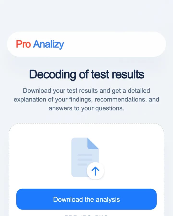
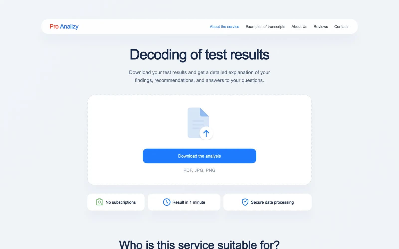
One card, centred, with a dashed drop zone and a single blue button. Nothing else on the first screen competes with it. Three short reassurances sit directly beneath — no subscription, result in a minute, secure processing — answering the objections that stop an upload before they can form.
One action, no alternatives
The upload card is the page. It states the accepted formats, gives a clearly marked drop area, and offers one button. There is no account step, no plan selection and no secondary path competing for the click.
Every reduction here is deliberate: the visitor is holding a document and a question, and the shortest route between those two things is the product.
Answering objections before they are raised
Under the card sit three chips: no subscription, result in one minute, secure data processing. Each one maps to a specific reason someone abandons a medical upload — recurring cost, unknown wait, privacy.
Putting them immediately below the action rather than in a features section further down means they are read at the moment of hesitation.
Proving the output before asking for the input
Further down, a before-and-after block shows a real lab table beside its decoded explanation. This is the single most persuasive element on the page, because the service is abstract until you have seen what comes back.
It also sets expectations honestly — the visitor knows the shape of the result before they upload anything.
Reach
Search is where this audience starts, usually with the name of a specific test or marker. Page titles and descriptions are written in that language rather than in service-brand terms, and the FAQ addresses the questions people actually type.
Build
The site is a Next.js application served behind nginx. The upload path is the only heavy interaction on the page, so the rest of the first screen is static and renders before any client-side code is needed.
What shipped
- Single-action upload flow with no account step
- Objection-handling chips placed directly under the primary action
- Before-and-after block showing a real result beside its explanation
- Next.js build served behind nginx
Frequently asked
Because the visitor arrives with a document and a question. Every additional option is a reason to hesitate, so the page offers one action and the reassurance needed to take it.
The service is abstract until you have seen its output. A real lab table beside its decoded explanation proves the value and sets honest expectations before anyone uploads a file.
PDF, JPG and PNG — stated on the card itself rather than hidden in help text.
Inside the site

“This project needed a very simple experience because people are often coming to us with questions about their health. Sakura kept everything clear and reassuring. Uploading a result now feels incredibly straightforward.”