Shuttle — File sharing that starts before the signup
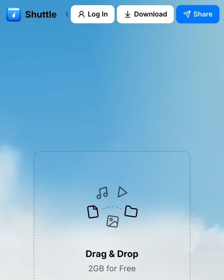
Shuttle is a file-sharing service whose pitch is ownership — your files, your rules. The site puts the actual drop zone on the first screen, so the product can be used before it is explained.
Challenge
File sharing is a solved problem with entrenched incumbents, and a new entrant gets a few seconds to show it is different. Explaining a privacy position in copy is slow; the faster argument is letting someone move a file immediately.
Approach
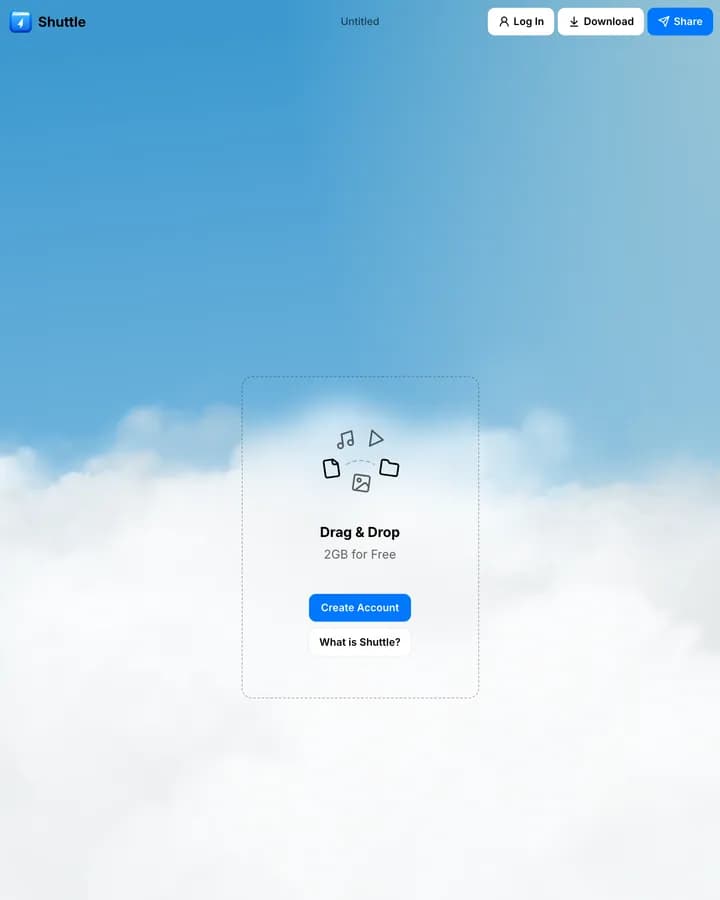
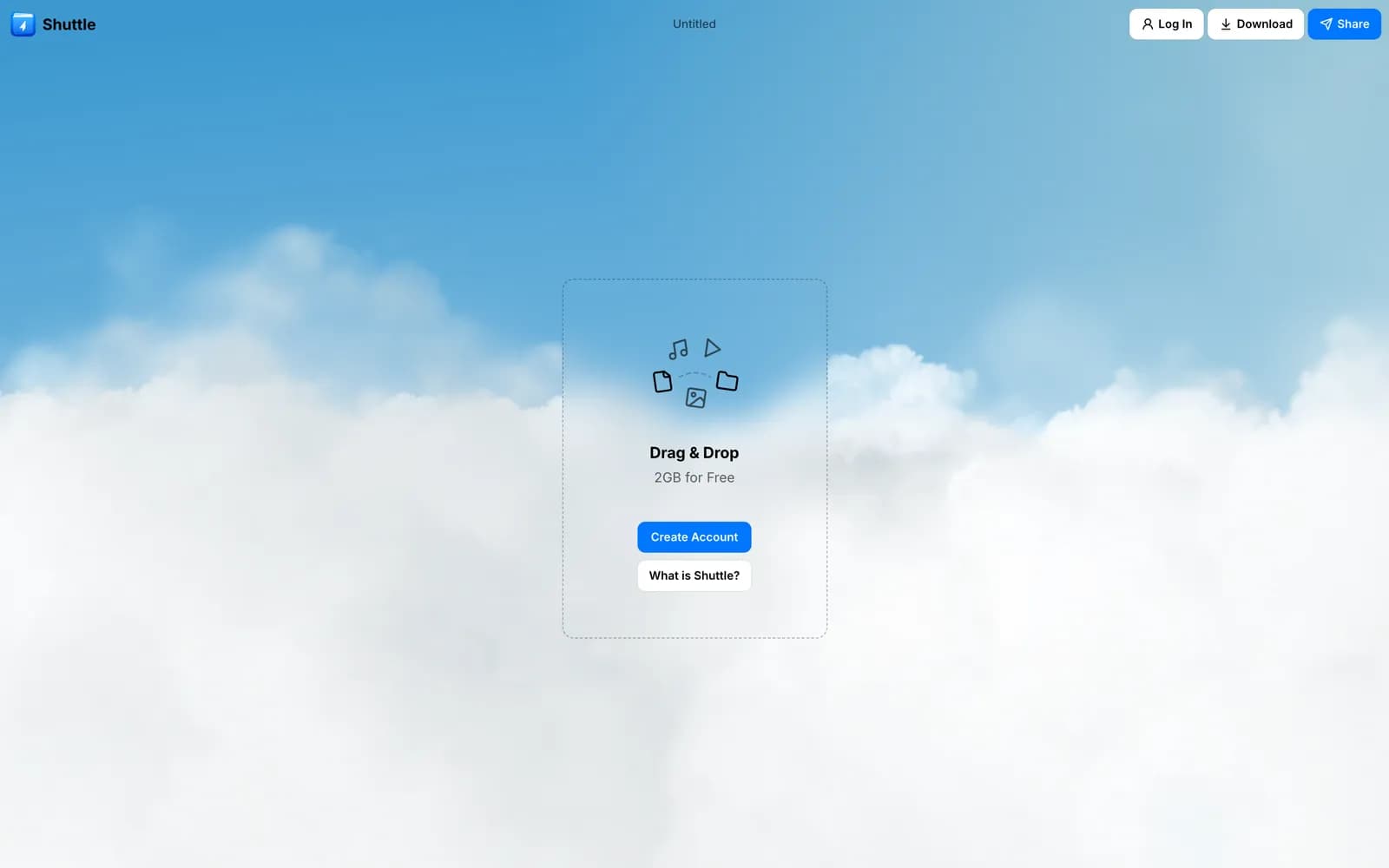
The hero is the product: a dashed drop zone with the free allowance stated inside it, an account button, and a 'what is Shuttle' link for anyone who wants the explanation first. Everything sits on a light sky backdrop that keeps a utility product from feeling like infrastructure.
The first screen is the app
Rather than a marketing hero with a signup below it, the page opens on the drop zone itself — file-type icons, the free allowance in plain text, and a single account action beneath.
A visitor with a file to send can start immediately. A visitor who wants to understand the position first has one link for that. Both paths are one click and neither blocks the other.
Stating the limit inside the offer
The free allowance is printed inside the drop zone rather than on a pricing page. Storage products lose people to uncertainty about what 'free' means, and answering it at the point of action removes the reason to leave and check.
Light where the category is dark
Most infrastructure products default to a dark technical palette. Shuttle uses a soft sky gradient and rounded, low-contrast interface elements, which suits a consumer-facing tool and separates it visually from services that look like they are sold to IT departments.
Build
The interface is built with Tailwind CSS and served through Cloudflare. The utility-first approach keeps the marketing surface and the application UI on one set of tokens, so the drop zone on the homepage is the same component as the one inside the product.
What shipped
- Working drop zone as the first screen
- Free allowance stated at the point of action rather than on a pricing page
- Light consumer-facing palette in a category that defaults to dark
- Tailwind CSS interface served through Cloudflare
Frequently asked
Because using the product is faster than reading about it. A visitor with a file to send can start immediately, and anyone who wants the privacy position first has a single link for it.
Storage products lose people to uncertainty about what free covers. Answering it at the moment of action removes the reason to go looking for a pricing page.
Tailwind CSS, served through Cloudflare, sharing one set of tokens with the product UI.
Inside the site
“The best part is that the website actually feels like the product. You can immediately see what Shuttle does instead of reading through a wall of text. That was exactly what we wanted.”