SevenGrid — A habit tracker that markets itself on what it removes
SevenGrid is a habit tracker built against the conventions of the category — no streaks, no guilt, no subscription. The site sells those absences, which meant leading with what the product deliberately does not do.
Challenge
Habit trackers compete on features, and the crowded end of that market runs on streak counters and loss aversion. SevenGrid's entire value is refusing that, but 'has fewer things' is a hard promise to make attractive without sounding unfinished.
Approach
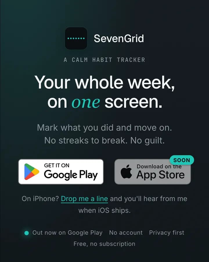
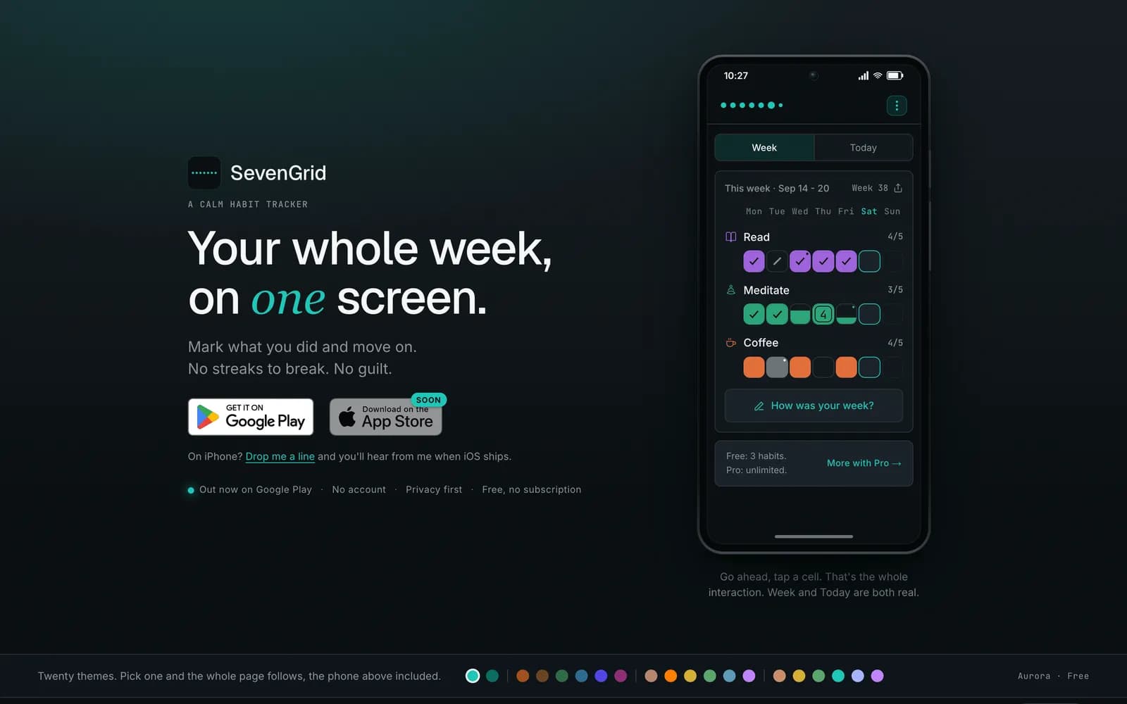
The positioning is stated as a benefit rather than an omission: mark what you did and move on, no streaks to break, no guilt. The week grid — the whole product, essentially — sits on the first screen at phone scale, and platform availability is stated honestly rather than implied.
Selling the subtraction
'No streaks to break. No guilt.' The two things the product removes are the headline benefit, placed immediately under the promise. That reframing is the entire positioning: the absence is the feature.
Below it, three plain qualifiers — no account, privacy first, free with no subscription — remove the remaining reasons to hesitate before the visitor has to look for them.
The product is the hero image
SevenGrid is a grid of seven days with tappable cells. There is no complex flow to demonstrate, so the site shows the actual interface at phone scale and lets it speak.
A short line beside it explains the whole interaction in one sentence — tap a cell, that is it — because a product this simple is undersold by a features list.
Being straight about platforms
The app is on one store and coming to the other. Rather than hiding that, the site shows both badges with the pending one clearly marked and offers to notify the visitor when it ships.
Honesty here costs nothing and prevents the worst outcome, which is a visitor tapping a badge that leads nowhere.
Reach
The audience for this product searches for the problem, not the category: variations of wanting to build a habit without the pressure of a streak. Titles, headings and FAQ copy are written in that language, which is also the clearest description of what the app is.
What shipped
- Positioning built on what the product removes rather than adds
- Interactive week grid shown at phone scale on the first screen
- Honest platform availability with a notify option for the pending store
- Copy written around problem-led search rather than category terms
Frequently asked
By stating the absence as a benefit. 'No streaks to break, no guilt' is a promise rather than a limitation, and it is the reason someone leaves a conventional tracker.
Because the product is a seven-day grid you tap. There is no flow to walk through, so showing it is faster and more honest than describing it.
Because a visitor will look for it either way. Marking it as pending and offering a notification is better than an unmarked badge that leads nowhere.
Inside the site
“Sakura understood the idea behind SevenGrid really well. We wanted something calm and different from the usual habit tracker apps, and the website communicates that feeling instantly.”