OUTFIT® — A studio's apparel drop as an editorial storefront
OUTFIT® is a design studio's signature apparel collection. The store is also a portfolio piece, so it had to sell the clothes and demonstrate the studio's craft in the same layout.
Challenge
A studio's own merchandise carries a double burden: it has to convert like a shop and look like the best work the studio has ever done. Default e-commerce templates fail the second test, while a purely editorial site fails the first.
Approach
We treated the storefront as a printed catalogue with a working basket. The wordmark sets at full page width, product photography runs as an unbroken grid beneath it, and the commerce affordances — bag, menu, price, category — stay small and typographic rather than boxed and buttoned.
Type as the entire brand system
The name sets edge to edge in a condensed grotesque, with the registered mark tucked into the final letterform. That single element does the branding, so the rest of the page can stay quiet and let the garments carry the colour.
Supporting copy is set small and red against off-white, sitting in a column beside the wordmark rather than centred beneath it — closer to a masthead than a hero.
A grid that reads as a lookbook
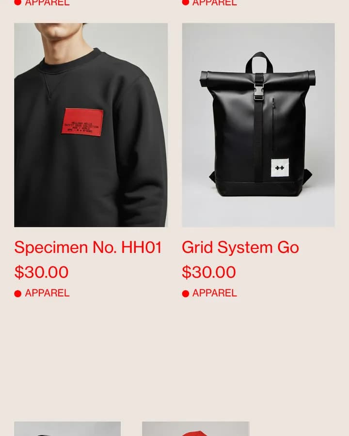
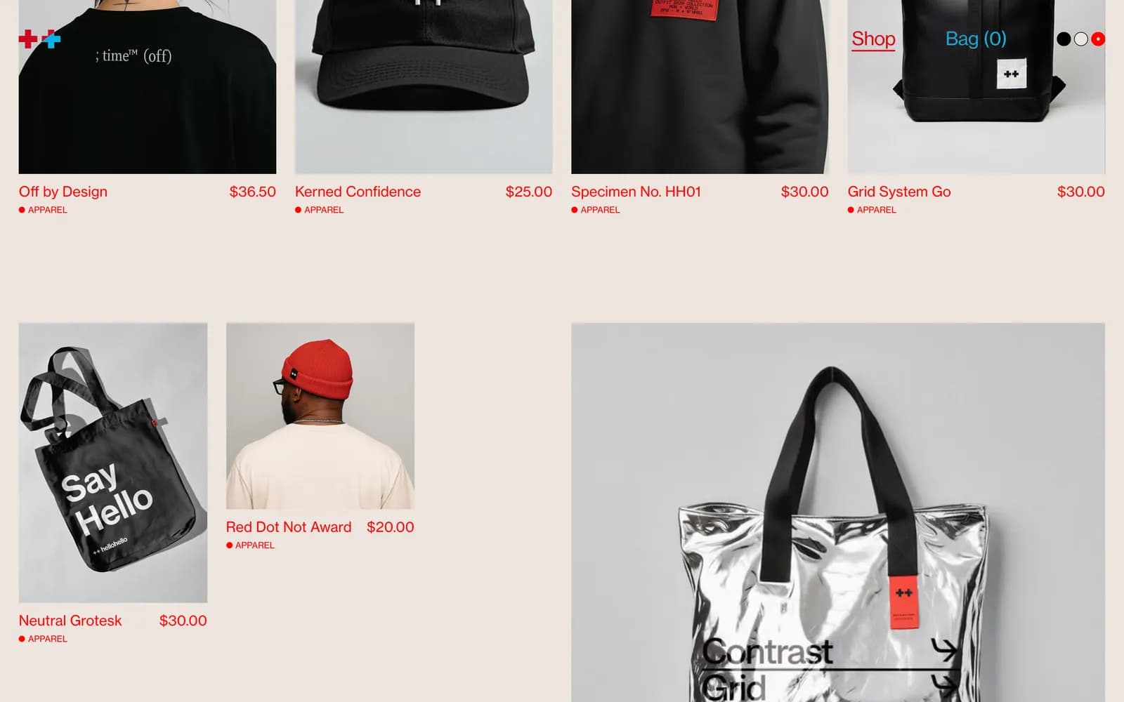
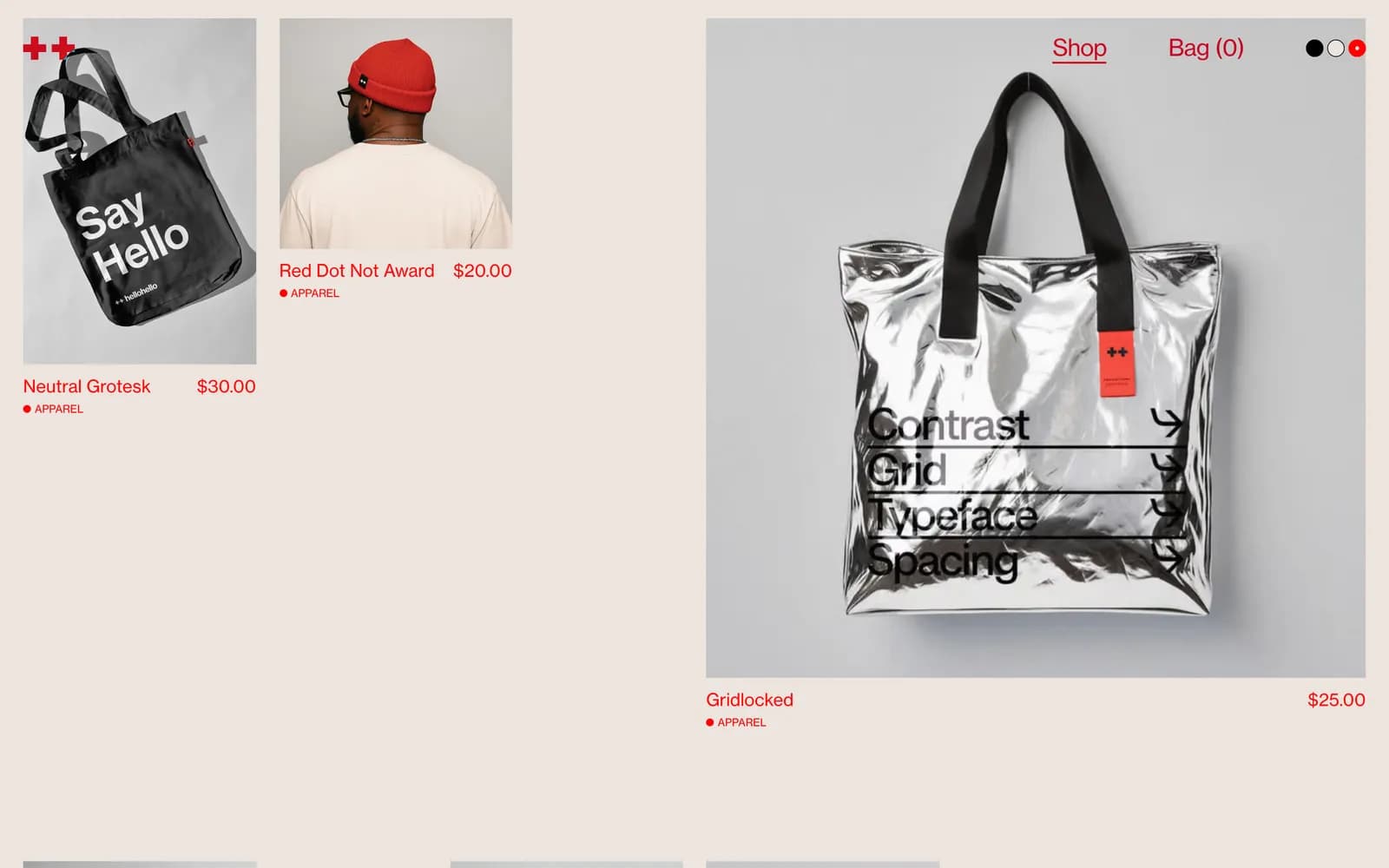
Products run in an even grid with no cards, borders or hover panels. Each item is a photograph, a name, a price and a category, set in the same type as the editorial copy.
Removing the card chrome is what makes it read as a catalogue rather than a template. It also means the photography sets the rhythm of the page, which is the point when the studio's own art direction is part of what is being sold.
Commerce that stays out of the way
Bag and menu sit in the top corners as plain text. Nothing pulses, nothing floats, no promotional interruption. The basket is always reachable and never louder than the product.
Build
The front end is a Next.js application deployed on Vercel, with Shopify behind it handling catalogue, checkout and inventory. That split keeps the storefront fully art-directed while leaving the parts a shop owner needs to change — products, prices, stock — in the tool built for it.
What shipped
- Editorial storefront with a full-width typographic masthead
- Card-free product grid that reads as a lookbook
- Next.js front end on Shopify for catalogue and checkout
- Deployed on Vercel
Frequently asked
Because the store doubles as a portfolio piece. A theme would have constrained the art direction; a Next.js front end on Shopify keeps the design free while checkout, inventory and catalogue stay in the platform built for them.
Card chrome makes a page read as a template. Removing it lets the photography set the rhythm, which matters when the studio's art direction is part of what is being sold.
The client, in Shopify. Only the presentation layer is custom.
Inside the site
“We wanted the store to feel more like a fashion editorial than a standard Shopify shop. Sakura understood the direction immediately. The result feels premium but still works like a real store.”