Honk — A messaging app that shows the feeling before the feature list
Honk is a real-time messaging app where you see every keystroke as it is typed. The site had to convey that feeling to someone who has never used it, in the seconds before they decide whether to install.

Challenge
Real-time messaging is hard to explain in a sentence and impossible to prove in a screenshot of a settings page. The product's appeal is kinetic — it lives in the moment a message appears letter by letter — and a static marketing page starts at a disadvantage.
Approach
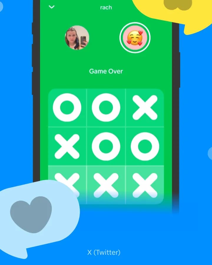
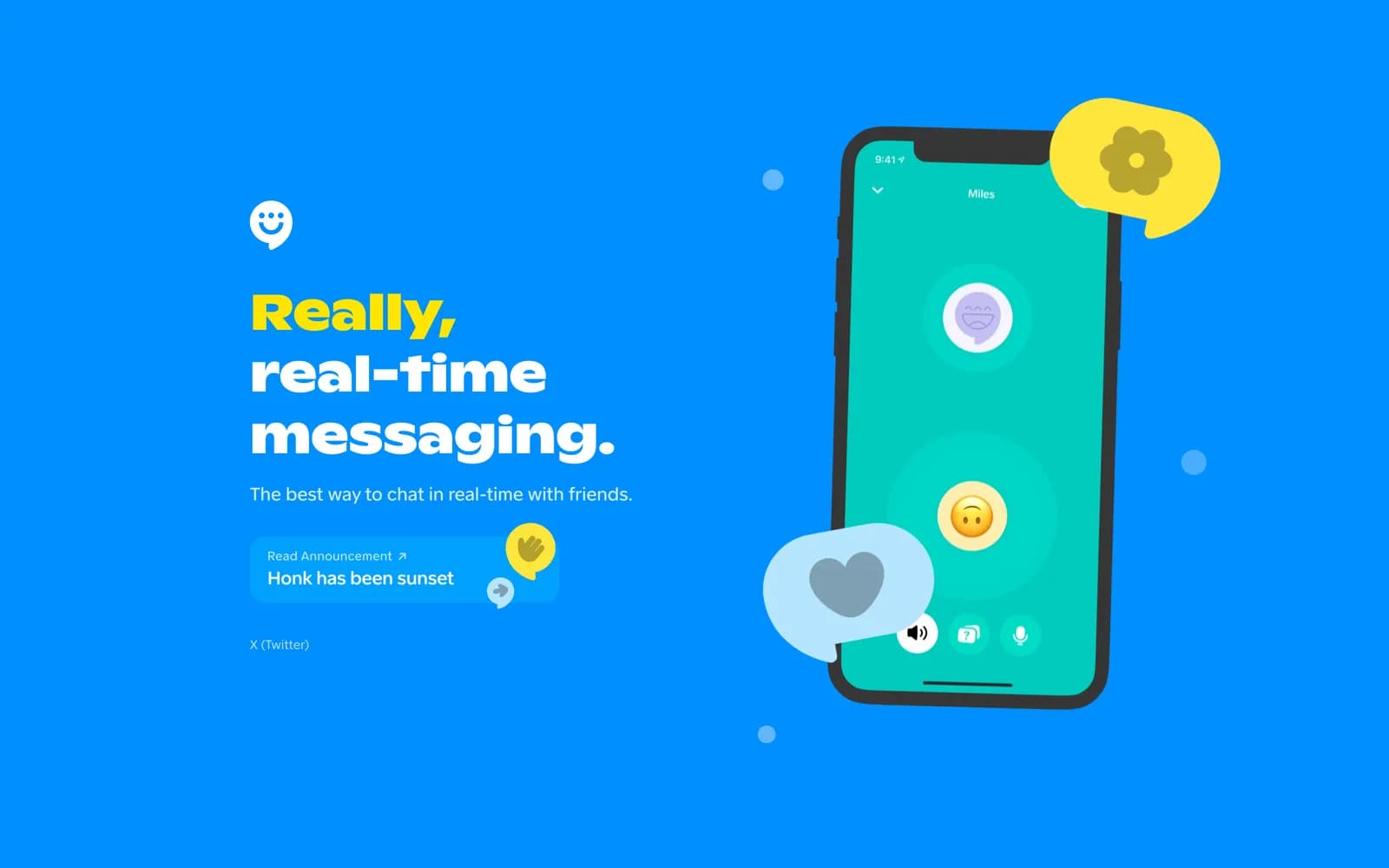
We put the app's own screens at the centre of the layout at phone scale, surrounded by the interface elements users actually recognise: message bubbles, reactions, the in-app game. The headline states the promise in five words and the supporting line qualifies it, and everything else on the first screen is product.
Showing the product, not describing it
The hero is built around a phone-sized frame running the real interface, with chat bubbles and reaction stickers breaking out of it onto the page background. The effect is closer to a product demo held up to the camera than a marketing illustration.
Copy is deliberately thin. Five words in the headline, one qualifying line under it, then the product does the explaining.
A palette that does structural work
The site runs on a saturated blue with yellow and green accents pulled directly from the app's own interface. Because the marketing surface and the product share a palette, the screens embedded in the page read as continuous with it rather than pasted in.
That also makes the announcement bar and secondary links legible without borders or boxes — colour alone separates them.
Carrying an announcement without breaking the page
Product news needed a place that would not require a redesign each time. A pill-shaped announcement sits inside the hero composition rather than as a bar above it, so it reads as part of the layout and can be edited or removed without leaving a gap.
Build
The marketing site is a Next.js application served through Cloudflare. The interface screens are the heaviest assets on the page, so they are sized per breakpoint rather than shipped at one resolution and scaled down in the browser.
What shipped
- Hero built around live interface screens at phone scale
- Colour system shared between the app and the marketing site
- In-layout announcement slot that can be edited without a redesign
- Next.js build served through Cloudflare
Frequently asked
By showing the interface rather than describing the mechanism. The page is built around the app's own screens at phone scale, with the recognisable parts — bubbles, reactions, the in-app game — breaking out onto the background.
Because the product explains itself faster than a paragraph can. The headline states the promise, one line qualifies it, and the remaining space is given to the interface.
Next.js and React, served through Cloudflare.
Inside the site
“The challenge was showing what makes Honk different without explaining it for five minutes. Sakura made the product the center of the website, and that was absolutely the right call.”