Burner — A hardware wallet sold as an object, not a spec sheet
Burner is a card-shaped hardware wallet for holding, spending and gifting crypto. The site had to sell a physical object to people used to buying software, so the product photography leads and the technical detail follows.
Challenge
Hardware wallets are usually marketed on security specifications, which reads as fear and looks identical across every competitor. Burner needed to feel like a considered consumer product — something you would hand to someone — while still answering the security questions that decide the purchase.
Approach
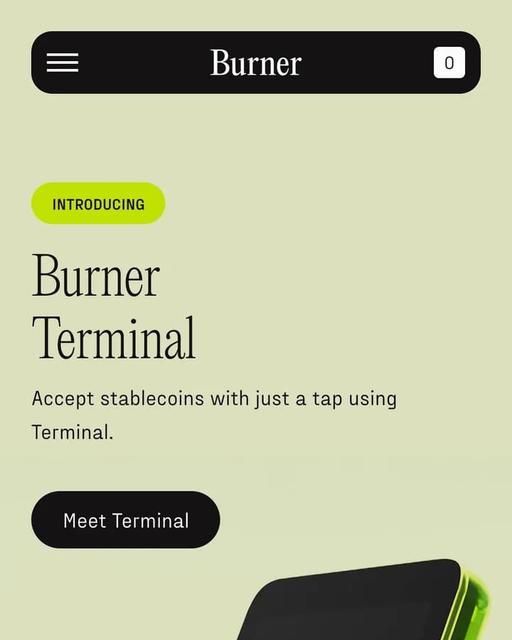
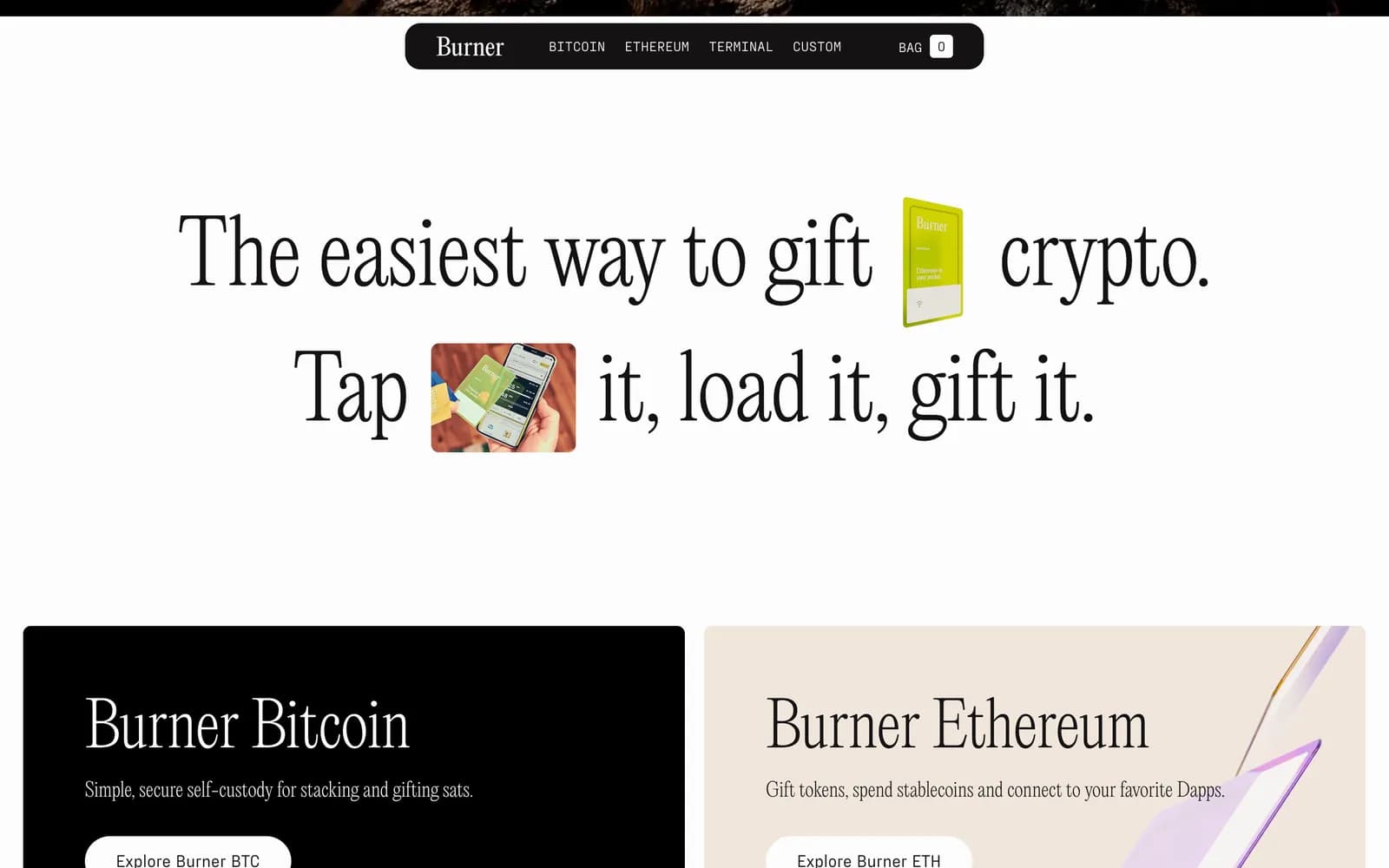
We built the page around photography of the card in a hand at real scale, with a serif headline that reads more like a magazine than a crypto site. The hero rotates through the product line so each variant gets the same treatment, and the buying options sit inside the hero rather than at the end of a scroll.
Leading with the object
The first screen is a photograph of the card held in a hand. Nothing communicates a physical product's size and finish faster, and it sidesteps the diagram-and-icon convention the category defaults to.
Purchase paths sit immediately under the headline — direct checkout alongside the marketplace option — so a visitor who already knows what they want never has to scroll to act.
A hero that carries a product line
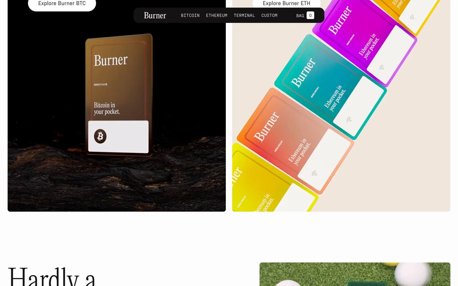
Burner ships several variants, and giving each its own page would have split the story. Instead the hero is a carousel: same layout, same typography, different product and colourway, with pagination dots as the only chrome.
Because the layout is shared, adding a variant is a content change rather than a design exercise.
Editorial typography over crypto conventions
The headline sets in a high-contrast serif at a size normally reserved for print. Body copy stays short and plain — what it does, how you use it, what it costs — with the technical reassurance placed after the product has been seen rather than in front of it.
The palette is taken from the product itself, so the page and the object read as the same brand rather than a site about a thing.
Build
The site is a Next.js application deployed on Vercel. Product imagery is heavy by nature, so the hero images carry explicit sizing and priority hints, and the carousel preloads only the adjacent slide rather than the whole set.
What shipped
- Product-led homepage with in-hero purchase options
- Rotating hero covering the full product line from one shared layout
- Next.js build deployed on Vercel
Frequently asked
Burner is a physical object, and its size, finish and feel are the things a photo answers instantly and a spec list never does. The technical detail is still there, just after the product has been seen.
They share one hero layout and rotate through a carousel, so every variant gets the same presentation and adding a new one is a content change rather than a redesign.
Next.js, deployed on Vercel.
Inside the site
“We didn't want Burner to look like another technical crypto product. Sakura made it feel like a real consumer product while still keeping the important details there. Really happy with how it turned out.”