BTC Markets — An exchange front page that explains itself before it sells
BTC Markets is an Australian digital-asset exchange. The brief was a marketing front end that could carry a regulated financial product without reading like a brochure — credible on first glance, with one obvious next step.

Challenge
Crypto exchanges have a credibility problem before a visitor reads a single word. The page had to answer 'is this real, and is it for me' immediately, for an audience that ranges from first-time buyers to people who already trade daily — without burying either group in the other's language.
Approach
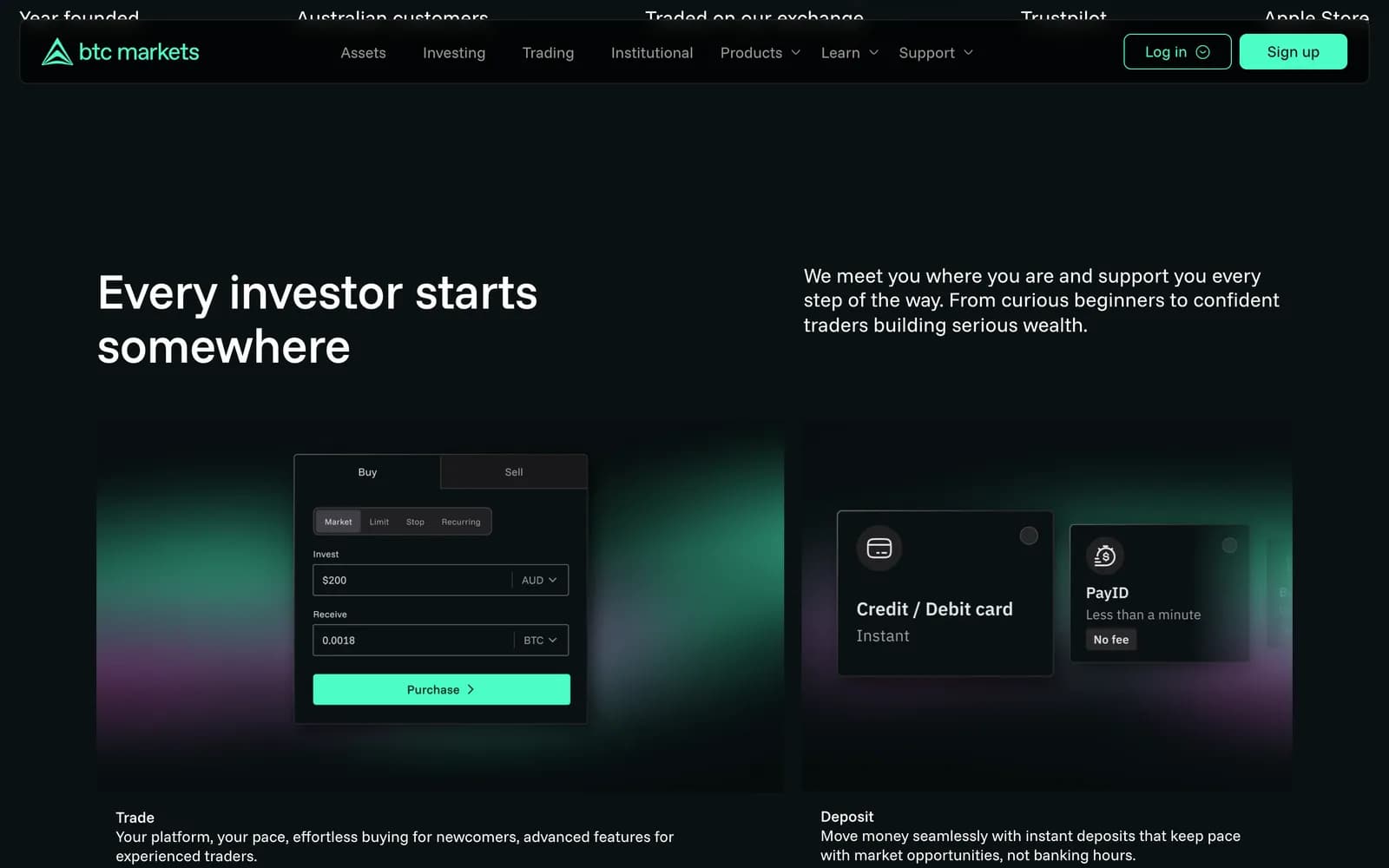
We led with a plain-language promise instead of product jargon, then put the proof directly beneath it: years operating, customer count, volume traded, and store ratings in a single row above the fold. One primary action repeats down the page; secondary paths stay in the navigation so they never compete with it.
Structuring the first screen
The hero carries three things and nothing else: a sentence that states what the product does, a sentence that says who it is for, and one button. Everything competing for that space — market tickers, price tables, promotional banners — was pushed below, where it supports the decision instead of interrupting it.
Directly under the fold sits a strip of proof points. Founding year, customer count, trading volume and app-store ratings are the fastest credibility a financial product can offer, and they cost the reader no effort.
Designing for two audiences at once
A first-time buyer and an active trader want opposite things from the same page. Rather than splitting into two entry points, the page is ordered by commitment: the plain-language promise first, the platform capabilities next, the depth an experienced trader looks for further down.
That ordering means nobody is served a wall of terminology they did not ask for, and nobody has to hunt for the detail that decides it for them.
Holding up on a phone
Most first visits to an exchange happen on a phone, often from a link. The mobile layout keeps the same order and the same single action, with the proof strip becoming a horizontally scannable row rather than a grid that would push the fold down.
Type sizes and touch targets were set so the primary action stays reachable without zooming, on the small screens this audience actually uses.
What shipped
- Marketing front end with a single primary action repeated down the page
- Above-the-fold trust strip: years operating, customers, volume, store ratings
- Layouts for phone, tablet and desktop from one design system
Frequently asked
To make the exchange readable to a first-time buyer without losing the people who already trade daily. The measure was whether a visitor could say what the product does, and take one clear action, without scrolling.
Financial products are judged on credibility before features. Years operating, customer count and volume are the cheapest credibility to read, so they sit where they cost the visitor no effort.
Yes. The mobile layout keeps the same content order and the same single call to action, with the proof strip reflowing rather than being cut.
Inside the site

“Sakura made the whole experience feel much clearer and more approachable. We wanted something professional without sounding like a financial brochure, and the new site found that balance really well.”